We applied for the Lilly Endowment Inc. grant to support the creation of a new, multiyear initiative to grow, improve, and celebrate character development at camps in late 2023.
Even before we knew if we would receive the grant, we understood that, from a visual perspective, character does not evoke any sort of obvious or intuitive imagery. Try it! When you think of the word character, what images do you imagine?
Knowing that the initiative would need artwork and its own logo, I began writing a creative brief. I find the process of writing a creative brief to be incredibly helpful — it distills my thoughts while also challenging the gaps in my thinking. I love words and language, so I often start with the origins or etymology of the words we’re attempting to provide visuals for.
The modern use of the word "character" really kicked off in the 17th century. In its origins, Greeks used the noun charaktēr — also found in the Latin language spelled character — meaning a mark; of distinctive quality. So that’s where the creative process would start.
Next, we considered what might influence our mark, feature, or trait. ACA’s new mission and vision have really inspired all of our work in 2024, and we wanted to tie that into the art. How could our artwork empower camps to create quality experiences that build a world of belonging and growth?
What types of images demonstrate belonging outside in nature with infinite opportunities for growth?
The strangely obvious answer to this question was the Fibonacci sequence. It starts with two numbers — typically 0 and 1 — with each subsequent number the sum of the two proceeding numbers. The Fibonacci sequence is wonderfully and beautifully observed in nature, appearing in the arrangement of leaves and the branching of trees, the spiral of galaxies, and the shapes of seashells. I believe that the Fibonacci sequence reflects the inherent beauty and harmony found all around us if we are simply looking for it. In fact, patterns in the Fibonacci sequence exhibit self-similarity, meaning that the sequence repeats certain patterns at different scales.
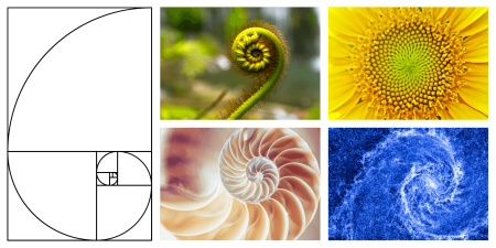
This sounds like character to me — something we should be looking for, beautiful and found embedded in our nature, capable of growth and scale.
The next step involved art concepting. Laura Foreman, ACA's creative services manager, took this idea and explored how we could tie the Fibonacci sequence into a logo. Here are a few of the early concepts we considered.
We landed on a variation of the nautilus shell design in two colors found in every camp — green (like grass and trees) and blue (like water and the sky).
When we are working on creative projects — like a logo for a new initiative — it is important to us that we gain broad stakeholder support prior to launching the final set of art. For this project, that meant seeking staff input. So, we sent ACA staff the final four variations of the artwork and put it to a vote. This was the final winning version.
Artwork by Laura Foreman. Laura Foreman is the creative services manager for the American Camp Association. As creative services manager, Laura is responsible for all ACA artwork including logos, flyers, Camping Magazine layout, and more.
Kelley Freridge is the chief marketing officer for the American Camp Association and vice president of the Rockford (Mich.) Public Schools Board of Education.

